OVERVIEW
The ACLU is one of the most recognizable non-profit organizations in the country, working to preserve the constitutional rights guaranteed to every person in the U.S. Alongside its National site, more than 50 separate affiliate sites are built and maintained by editors without a designer in the room. I joined the design team's effort to establish a design system meant to help keep national and affiliates aligned through auditing, building, and documenting 4 components end to end.
TEAM
Design Systems
TIMELINE
3 months
ROLE
Product Design Intern
SKILLS
Component design, Documentation,
Accessibility, Engineering handoff
The context
The context
50+ affiliate ACLU sites are edited by people without a designer in the room, so documentation is what keeps them consistent.
50+ affiliate ACLU sites are edited by people without a designer in the room, so documentation is what keeps them consistent.
Editors for each affiliate site work separately from the national organization and build their pages in WordPress with premade components. There's no designer sitting next to most of them, and the components set the bound for what the site can become. This means the design system is the source of truth standing between 50 different sites and 50 different interpretations.
When I joined, the team was actively in the process of rebuilding that system, specifically using an atomic structure. The system would now be defined by components and variables that made up tokens, atoms, molecules, and organisms. Each sprint, these components would be handed off to engineering and built into a shared Parent Theme so national and affiliates could be aligned.
I owned four components (Notice, Tabs, Floating-Button, and Text-Field) end to end by following the process of auditing, updating, building, documenting, and handing off components to engineering. I'll be going through the process of building the Notice component.
Editors for each affiliate site work separately from the national organization and build their pages in WordPress with premade components. There's no designer sitting next to most of them, and the components set the bound for what the site can become. This means the design system is the source of truth standing between 50 different sites and 50 different interpretations.
When I joined, the team was actively in the process of rebuilding that system, specifically using an atomic structure. The system would now be defined by components and variables that made up tokens, atoms, molecules, and organisms. Each sprint, these components would be handed off to engineering and built into a shared Parent Theme so national and affiliates could be aligned.
I owned four components (Notice, Tabs, Floating-Button, and Text-Field) end to end by following the process of auditing, updating, building, documenting, and handing off components to engineering. I'll be going through the process of building the Notice component.

First, Donation Forms
First, Donation Forms
I first worked on Donation forms, which are ACLU's most sensitive surface, to learn the new system and help scope future work.
I first worked on Donation forms, which are ACLU's most sensitive surface, to learn the new system and help scope future work.
Before any component work, I rebuilt two of ACLU's donation forms with the recently updated tokens and components.
Donation forms are the most sensitive point on ACLU's product surface. People are sharing their name, address, and payment information to an organization whose reputation depends on handling that carefully. There's also a high cost to changing them without testing, so the mockups were used primarily for growth product and engineering leads to scope the work, plan future growth experiments, and figure out where it would be placed on the roadmap.
It also helped me learn and understand the new tokens before I started building anything of my own.
Before any component work, I rebuilt two of ACLU's donation forms with the recently updated tokens and components.
Donation forms are the most sensitive point on ACLU's product surface. People are sharing their name, address, and payment information to an organization whose reputation depends on handling that carefully. There's also a high cost to changing them without testing, so the mockups were used primarily for growth product and engineering leads to scope the work, plan future growth experiments, and figure out where it would be placed on the roadmap.
It also helped me learn and understand the new tokens before I started building anything of my own.


NOTICE: THE AUDIT
NOTICE: THE AUDIT
Editors were often misusing the Notice component, which raised a question I didn't expect: should it exist at all?
Editors were often misusing the Notice component, which raised a question I didn't expect: should it exist at all?

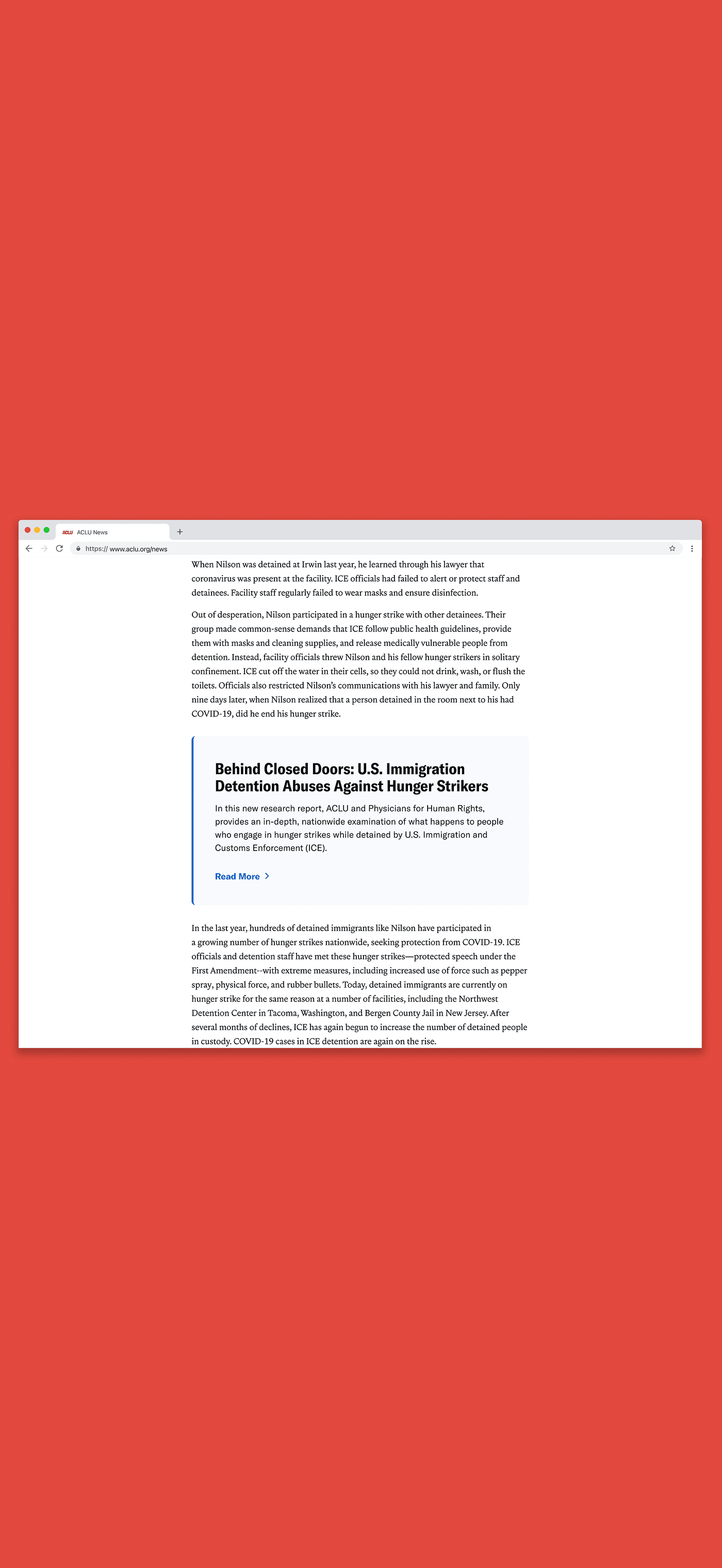
The Notice component is a box with a background color used to call out information related to nearby content. My task was to audit, update, and document it.
During my audit, I found it on pages like news posts, Know Your Rights pages, campaigns, and contact pages. It could live on any page with text, which made it flexible, but that same flexibility meant editors were putting it to very different uses than intended.
They were often using it as a pull quote, or as a decorative wrapper around long chunks of text, rather than for concise, supportive information.
The Notice component is a box with a background color used to call out information related to nearby content. My task was to audit, update, and document it.
During my audit, I found it on pages like news posts, Know Your Rights pages, campaigns, and contact pages. It could live on any page with text, which made it flexible, but that same flexibility meant editors were putting it to very different uses than intended.
They were often using it as a pull quote, or as a decorative wrapper around long chunks of text, rather than for concise, supportive information.

Not all of them were misused, but enough that the pattern was obvious. Editors wanted to emphasize a sentence, and the Notice was the component that made text stand out. The closest component we had to what they actually wanted was the Pullquote component, which raised a question I didn't expect: should Notice exist at all, or should it merge into a broader component?
Not all of them were misused, but enough that the pattern was obvious. Editors wanted to emphasize a sentence, and the Notice was the component that made text stand out. The closest component we had to what they actually wanted was the Pullquote component, which raised a question I didn't expect: should Notice exist at all, or should it merge into a broader component?
THE ANSWER
THE ANSWER
The fix wasn't visual, but instead involved being explicit in the documentation
The fix wasn't visual, but instead involved being explicit in the documentation
After discussion, the design team and I agreed to keep the Notice component. But the fix wasn't visual, it was definitional. The original documentation described what a Notice was without clearly explaining when it should be used. An editor or designer with a sentence they want to emphasize could reasonably read that Notice "calls attention to information" and choose it over a pull quote, which was similarly described as "emphasizing key phrases or takeaways."
This realization led to two changes. First, we renamed Pullquote to Text Callout, a more descriptive name that better reflects the component's purpose. Second, I rewrote the documentation to clearly define when a Notice should and shouldn't be used, while recommending alternative components for common use cases.
After discussion, the design team and I agreed to keep the Notice component. But the fix wasn't visual, it was definitional. The original documentation described what a Notice was without clearly explaining when it should be used. An editor or designer with a sentence they want to emphasize could reasonably read that Notice "calls attention to information" and choose it over a pull quote, which was similarly described as "emphasizing key phrases or takeaways."
This realization led to two changes. First, we renamed Pullquote to Text Callout, a more descriptive name that better reflects the component's purpose. Second, I rewrote the documentation to clearly define when a Notice should and shouldn't be used, while recommending alternative components for common use cases.

I believed the key to preventing misuse was adding the alternative suggestions. "Don't use this decoratively" is helpful guidance, but adding "Use a pull quote instead" gives editors a clear, actionable next step.
I believed the key to preventing misuse was adding the alternative suggestions. "Don't use this decoratively" is helpful guidance, but adding "Use a pull quote instead" gives editors a clear, actionable next step.
THE REBUILD
THE REBUILD
The old Notice was a brand-blue box that disrupted content hierarchy requiring updates using the new tokens.
The old Notice was a brand-blue box that disrupted content hierarchy requiring updates using the new tokens.
The old Notice was a box using ACLU's blue branding color. The team was moving away from stark color blocks, wanting to use the brand blue more intentionally and reduce its visual weight throughout the site.
Rebuilding the component started with the color token documentation. The tokens follow a semantic naming system, so I used the background color tokens to guide my explorations. Since Notice shows up on nearly every text-heavy page, I needed to consider the dark-mode variants as well. Most tokens in the system provided that logic, but the blue-5 token is documented as "unsuitable for dark backgrounds." That ruled it out early, narrowing the real exploration down to default, subtle, and featured.
Colors with stark contrast, like background-default, felt too heavy. Content inside a Notice should support the main content, not compete with it. Background-subtle did the opposite, reading as almost too invisible. Background-featured still felt too weighted on dark pages . None of the three struck the right balance on their own, so I started looking at ways to add visibility outside of just container color, which led to experimenting with a left stroke on the Notice container instead.
The old Notice was a box using ACLU's blue branding color. The team was moving away from stark color blocks, wanting to use the brand blue more intentionally and reduce its visual weight throughout the site.
Rebuilding the component started with the color token documentation. The tokens follow a semantic naming system, so I used the background color tokens to guide my explorations. Since Notice shows up on nearly every text-heavy page, I needed to consider the dark-mode variants as well. Most tokens in the system provided that logic, but the blue-5 token is documented as "unsuitable for dark backgrounds." That ruled it out early, narrowing the real exploration down to default, subtle, and featured.
Colors with stark contrast, like background-default, felt too heavy. Content inside a Notice should support the main content, not compete with it. Background-subtle did the opposite, reading as almost too invisible. Background-featured still felt too weighted on dark pages . None of the three struck the right balance on their own, so I started looking at ways to add visibility outside of just container color, which led to experimenting with a left stroke on the Notice container instead.

I explored the stroke at a few weights and landed on 4px, the large token, based on our stroke documentation, where the large token "helps an element stand out among dense content."
I explored the stroke at a few weights and landed on 4px, the large token, based on our stroke documentation, where the large token "helps an element stand out among dense content."

During the audit, I also found that CTAs within Notice varied wildly in style, some as underlined text links, others as solid buttons, others as inline links within a sentence, despite WordPress never actually including a dedicated space for CTAs in the first place.
Editors were improvising their own treatment each time. That inconsistency would likely make it harder for users to recognize a Notice's CTA as a predictable pattern across the site. A Notice needed one defined CTA treatment.
During the audit, I also found that CTAs within Notice varied wildly in style, some as underlined text links, others as solid buttons, others as inline links within a sentence, despite WordPress never actually including a dedicated space for CTAs in the first place.
Editors were improvising their own treatment each time. That inconsistency would likely make it harder for users to recognize a Notice's CTA as a predictable pattern across the site. A Notice needed one defined CTA treatment.

I proposed adding an action field in WordPress for Notice, styled using a nested Text-Link component, since a button inside a Notice competes with the page's primary call to action. I also wrote help text for editors alongside the new field, to guide proper and accessible use of the CTA.
I proposed adding an action field in WordPress for Notice, styled using a nested Text-Link component, since a button inside a Notice competes with the page's primary call to action. I also wrote help text for editors alongside the new field, to guide proper and accessible use of the CTA.

ACCESSIBILITY
ACCESSIBILITY
Notice needed to read like a note, not an alert, so it’s implementation by engineering was important for accessibility purposes.
Notice needed to read like a note, not an alert, so it’s implementation by engineering was important for accessibility purposes.
Part of the accessibility documentation involved researching best practices for implementing these components accessibly, including for people who use screen readers.
The Notice sits next to the main content, so it needed to read like a note, rather than an alert. I documented ues of role="note" instead of role="alert" or aria-live when developing, since those force a screen reader to stop and announce content immediately, which should be reserved for real alerts.
I also defined the focus and read order for the component. The container itself doesn't take keyboard focus unless there's an interactive text link inside it.
Part of the accessibility documentation involved researching best practices for implementing these components accessibly, including for people who use screen readers.
The Notice sits next to the main content, so it needed to read like a note, rather than an alert. I documented ues of role="note" instead of role="alert" or aria-live when developing, since those force a screen reader to stop and announce content immediately, which should be reserved for real alerts.
I also defined the focus and read order for the component. The container itself doesn't take keyboard focus unless there's an interactive text link inside it.


WHAT SHIPPED?
WHAT SHIPPED?
Four components were documented, shared, and handed off for QA before being added to the Parent Theme
Four components were documented, shared, and handed off for QA before being added to the Parent Theme
I handed off 4 fully documented components (Notice, Tabs, Floating-Button, and Text-Field) to Engineering, to be built into a shared Parent Theme so national and 50+ affiliates could eventually pull from one source. They're currently on backlog for QA before that happens.
Each component had documentation across five surfaces: specs for engineering, accessibility guidance, WordPress editor fields and help text, affiliate-specific notes, and before/after mocks with archival notes on what changed and why.
I presented the components across engineering variety hours, answering questions and gathering feedback before each handoff.
I handed off 4 fully documented components (Notice, Tabs, Floating-Button, and Text-Field) to Engineering, to be built into a shared Parent Theme so national and 50+ affiliates could eventually pull from one source. They're currently on backlog for QA before that happens.
Each component had documentation across five surfaces: specs for engineering, accessibility guidance, WordPress editor fields and help text, affiliate-specific notes, and before/after mocks with archival notes on what changed and why.
I presented the components across engineering variety hours, answering questions and gathering feedback before each handoff.


REFLECTION
REFLECTION
Design documentation turned out to mean anticipating how someone would misread a decision.
Design documentation turned out to mean anticipating how someone would misread a decision.
I came in thinking design systems and writing documentation mostly entailed providing relevant details and explaining a decision. Instead, I learned that the best documentation anticipates how someone might misread it.
Most of my design work before this pointed at a consumer. This pointed at the consumer and people building for the consumer. I learned language is sensitive and powerful, and building a design system starts with thinking about how the system can scale.
Thank you to my manager, Sarah, and the rest of the design team at the ACLU for their guidance, feedback, and support during my internship!
I came in thinking design systems and writing documentation mostly entailed providing relevant details and explaining a decision. Instead, I learned that the best documentation anticipates how someone might misread it.
Most of my design work before this pointed at a consumer. This pointed at the consumer and people building for the consumer. I learned language is sensitive and powerful, and building a design system starts with thinking about how the system can scale.
Thank you to my manager, Sarah, and the rest of the design team at the ACLU for their guidance, feedback, and support during my internship!
OVERVIEW
The ACLU is one of the most recognizable non-profit organizations in the country, working to preserve the constitutional rights guaranteed to every person in the U.S. Alongside its National site, more than 50 separate affiliate sites are built and maintained by editors without a designer in the room. I joined the design team's effort to establish a design system meant to help keep national and affiliates aligned through auditing, building, and documenting 4 components end to end.
TEAM
Design Systems
TIMELINE
3 months
ROLE
Product Design Intern
SKILLS
Component design, Documentation,
Accessibility, Engineering handoff
OVERVIEW
The ACLU is one of the most recognizable non-profit organizations in the country, centering their work around the preservation of Constitutional rights and United States laws that are guaranteed for everyone in it. Along with it’s National site, there are also more than 50+ separate affiliate websites, one for every state.
TEAM
Design Systems
TIMELINE
3 months
ROLE
Product Design Intern
SKILLS
Component design, Documentation,
Accessibility, Engineering handoff