OVERVIEW
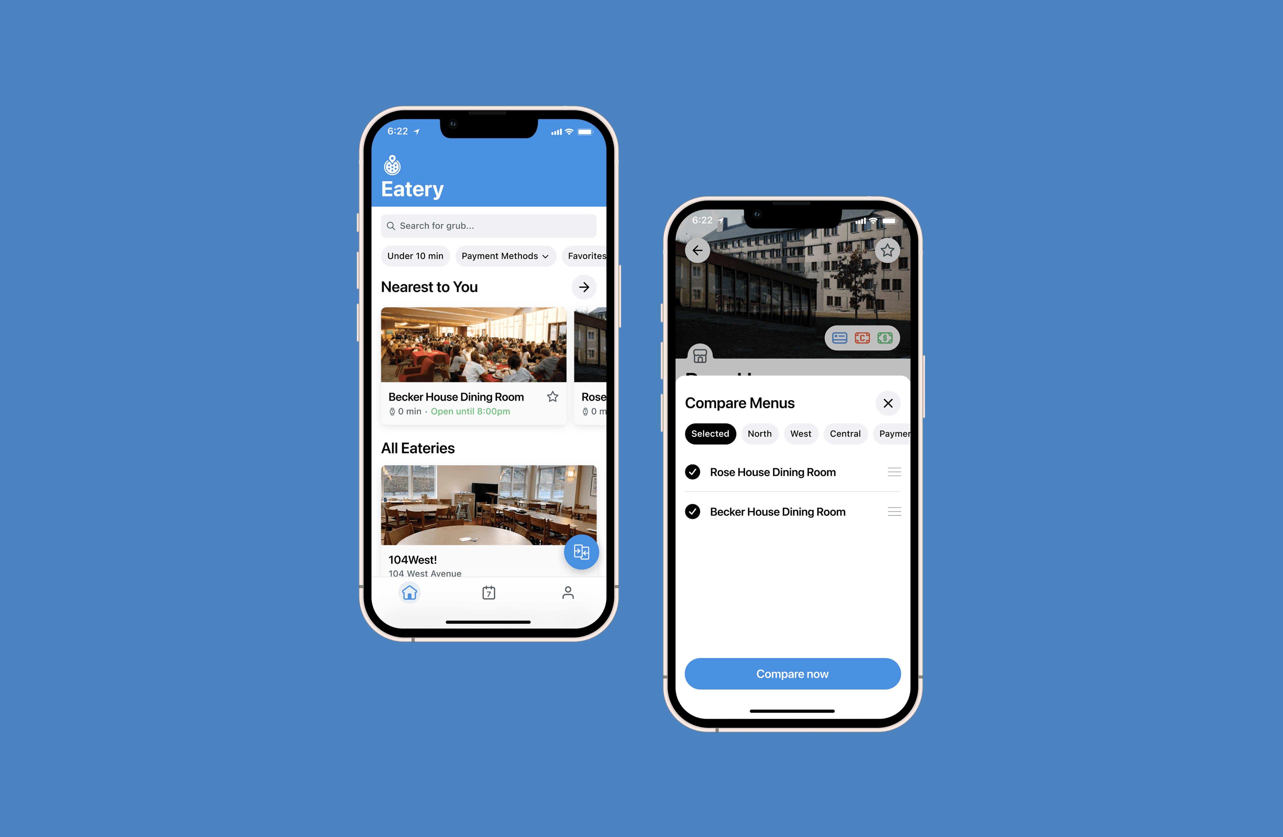
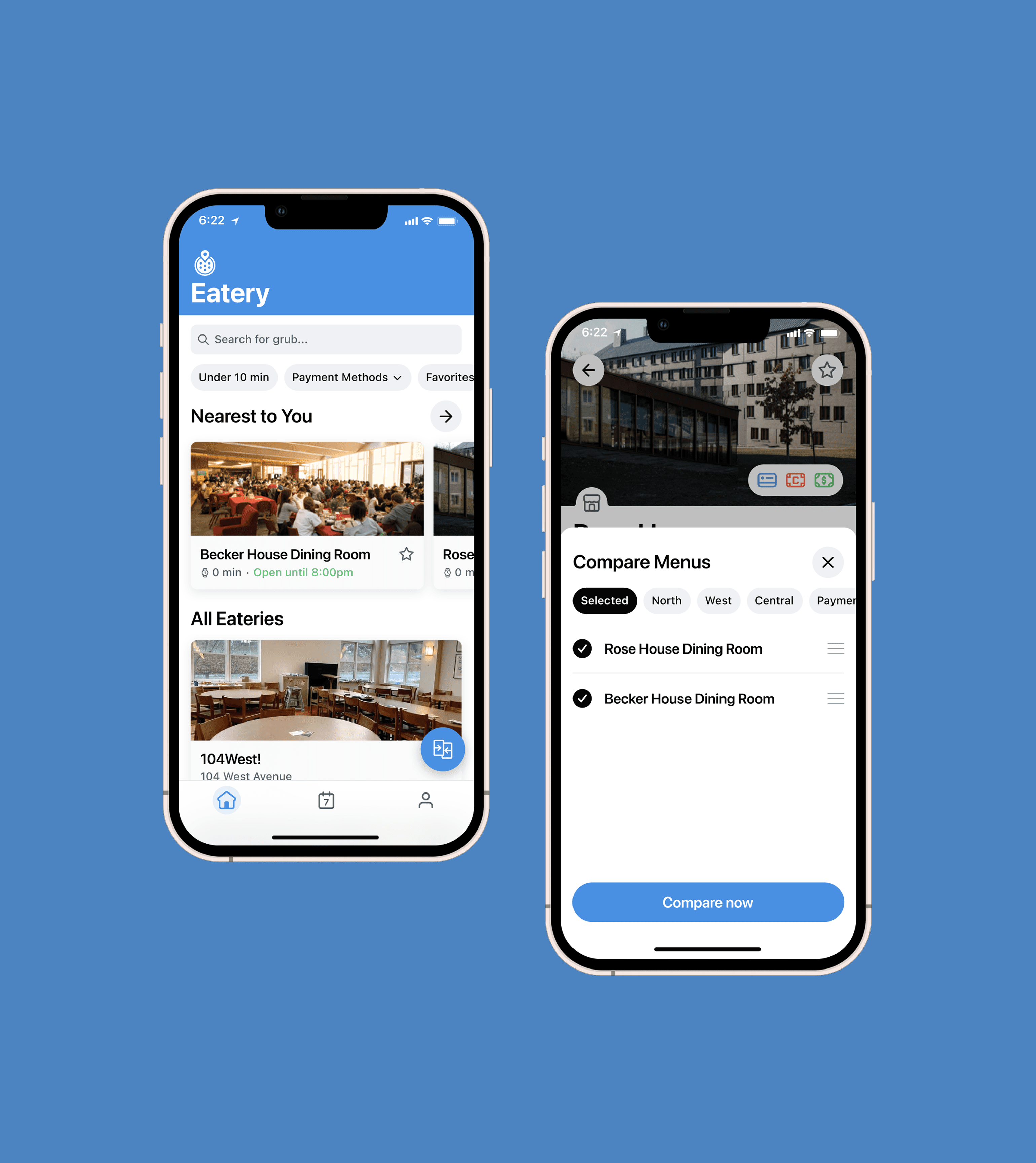
Eatery is Cornell's central dining information app, serving over 10,000 students and faculty. The mission of the app is to help its users make quick and informed dining decisions. To better support that mission, my task was to design the Compare Menus feature, an efficient way to view more than one dining hall's menu.
TEAM
Design
TIMELINE
3 months
ROLE
Product Designer
SKILLS
Interaction Design,
UX Research,
Mobile UI
The PROBLEM
The PROBLEM
Eatery's most basic goal, helping users decide where to eat at Cornell, was an extremely ineffiecient process
Eatery's most basic goal, helping users decide where to eat at Cornell, was an extremely ineffiecient process
The current flow was straightforward, but slow. Open the app, find a dining hall, open its menu, scroll, exit, open a different menu, scroll, exit, go back to the first one for a refresher, repeat until something sounds good (Yes, it takes as long as reading that felt).
The average time spent on the app was 5 minutes and 36 seconds, most of it, people going back and forth between menus they'd already seen.
The current flow was straightforward, but slow. Open the app, find a dining hall, open its menu, scroll, exit, open a different menu, scroll, exit, go back to the first one for a refresher, repeat until something sounds good (Yes, it takes as long as reading that felt).
The average time spent on the app was 5 minutes and 36 seconds, most of it, people going back and forth between menus they'd already seen.
The current flow was straightforward, but slow. Open the app, find a dining hall, open its menu, scroll, exit, open a different menu, scroll, exit, go back to the first one for a refresher, repeat until something sounds good (Yes, it takes as long as reading that felt).
The average time spent on the app was 5 minutes and 36 seconds, most of it, people going back and forth between menus they'd already seen.

THE RESEARCH
THE RESEARCH
Comparing menus was consistently a part of the user's journey, but there was a clear need for a streamlined way to do so
Comparing menus was consistently a part of the user's journey, but there was a clear need for a streamlined way to do so
At the beginning of the semester, I sent out a survey and received 64 responses. There was a trend in responses that supported a desire for a more efficient way to navigate and compare dining menus. Many were already constantly switching between multiple eateries before deciding where to eat, and this constant back-and-forth placed a strain on users' cognitive load, creating friction in the decision-making process.
Most people filtering by location looked at somewhere between 8 and 24 eateries in a single session, averaging 3 menu views before deciding. There wasn't a current way to seamlessly view more than one of those at a time, which led to designing Compare Menus.
At the beginning of the semester, I sent out a survey and received 64 responses. There was a trend in responses that supported a desire for a more efficient way to navigate and compare dining menus. Many were already constantly switching between multiple eateries before deciding where to eat, and this constant back-and-forth placed a strain on users' cognitive load, creating friction in the decision-making process.
Most people filtering by location looked at somewhere between 8 and 24 eateries in a single session, averaging 3 menu views before deciding. There wasn't a current way to seamlessly view more than one of those at a time, which led to designing Compare Menus.

THE ENTRY POINT
THE ENTRY POINT
The feature needed to be accessible as early and conveniently possible to support quick decision making goals.
The feature needed to be accessible as early and conveniently possible to support quick decision making goals.
Because the primary action our users take is viewing a dining menu, having the compare menus feature be accessible on the homepage was the most fitting. And naturally, the user should be able to access the feature while viewing a menu to begin comparing immediately.
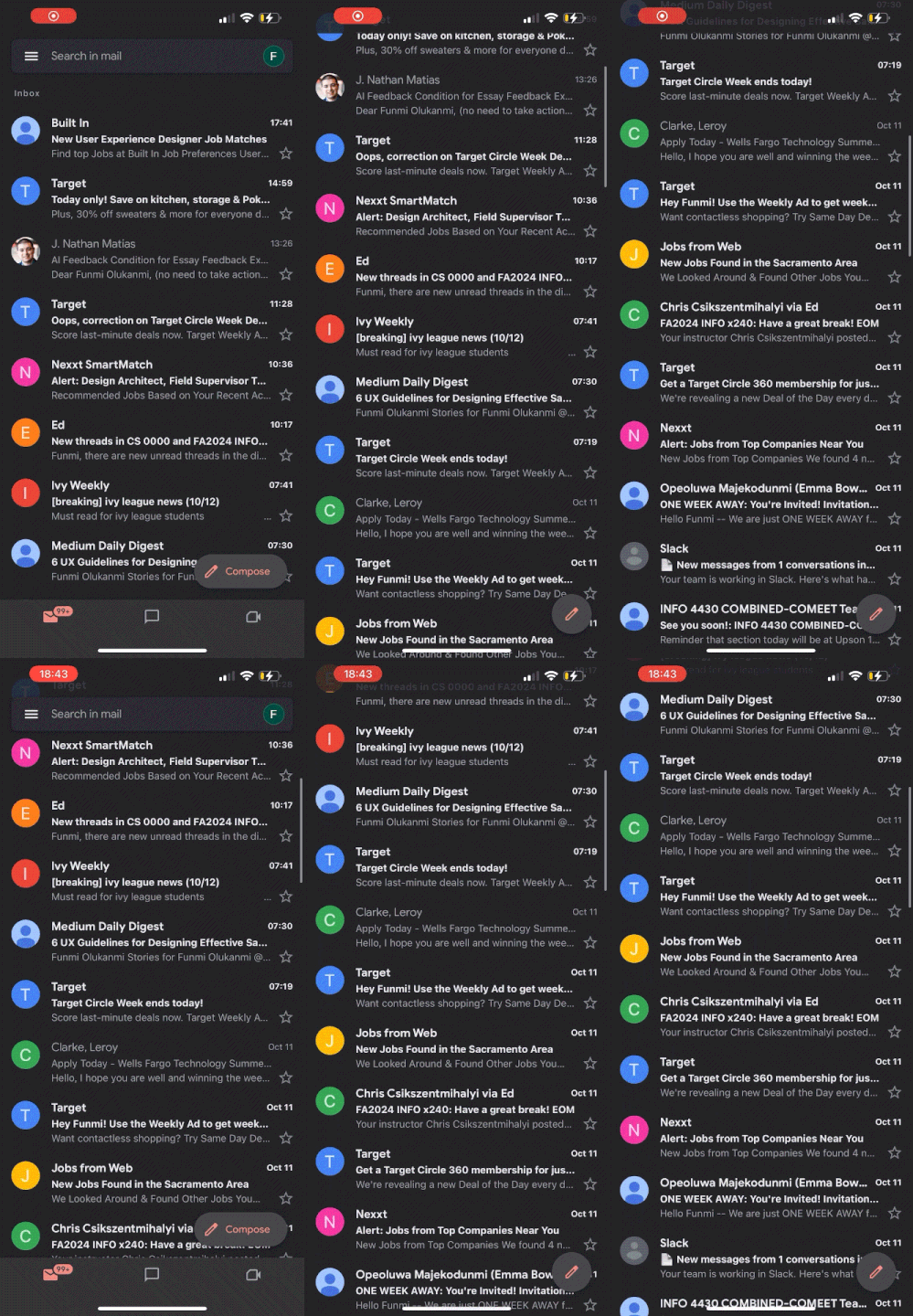
I explored surfacing the feature through a button. The harder question was communicating the button's function and making it feel like an active tool. I looked to Google’s Gmail app for inspiration. It’s expandable Compose button felt like it could help accomplish my goals. The button would start closed by default and expand into a labeled button when a user scrolled down the homepage. Scrolling was already something people were doing constantly while deciding where to eat, so the button showing up mid-scroll would increase its affordance when a user was already comparing options in their head.
Because the primary action our users take is viewing a dining menu, having the compare menus feature be accessible on the homepage was the most fitting. And naturally, the user should be able to access the feature while viewing a menu to begin comparing immediately.
I explored surfacing the feature through a button. The harder question was communicating the button's function and making it feel like an active tool. I looked to Google’s Gmail app for inspiration. It’s expandable Compose button felt like it could help accomplish my goals. The button would start closed by default and expand into a labeled button when a user scrolled down the homepage. Scrolling was already something people were doing constantly while deciding where to eat, so the button showing up mid-scroll would increase its affordance when a user was already comparing options in their head.
THE COMPARISON FLOW
THE COMPARISON FLOW
Using UI elements like modals and tabs made the comparison process feel quick and seamless
Using UI elements like modals and tabs made the comparison process feel quick and seamless
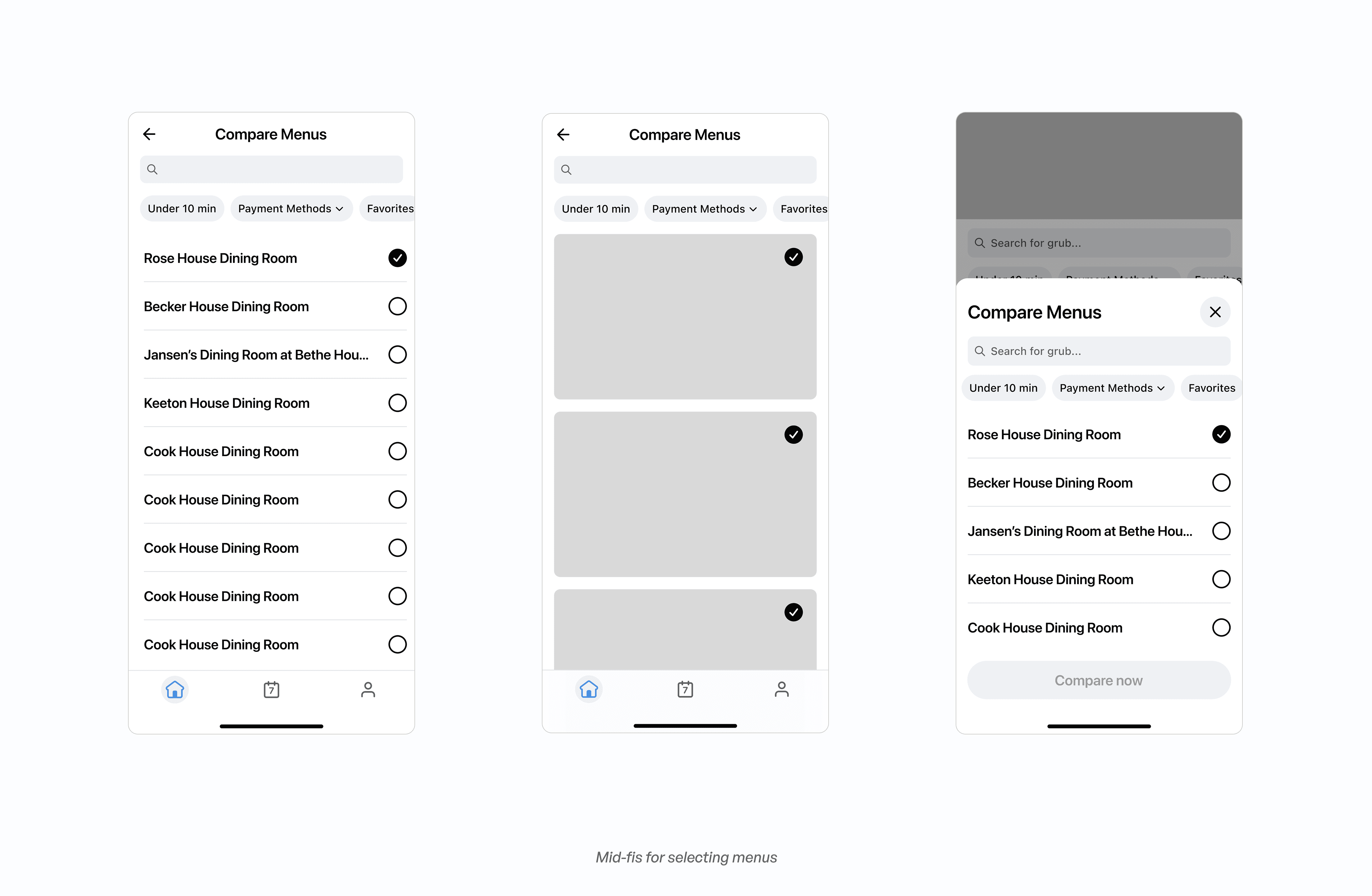
I explored how selecting which eateries to compare would be displayed through opening a full page versus a modal. The full page kept the app's existing navigation consistent, but it added a step in the flow, which worked against the core goal of saving time with the feature.
The modal was quicker to trigger and could still follow a consistent navigation pattern. I decided filtering would be the only navigation rather than including search. Adding search would've cost more engineering time than it was worth, especially after learning majority of users navigate menus with location filters.
I explored how selecting which eateries to compare would be displayed through opening a full page versus a modal. The full page kept the app's existing navigation consistent, but it added a step in the flow, which worked against the core goal of saving time with the feature.
The modal was quicker to trigger and could still follow a consistent navigation pattern. I decided filtering would be the only navigation rather than including search. Adding search would've cost more engineering time than it was worth, especially after learning majority of users navigate menus with location filters.
Comparing the menus themselves came down to deviating from our traditional mental model of comparing two or more things at one time. To avoid cognitive load on the screen, exploring through interaction became much more effective. I explored three explorations: swiping alone, swiping with a dropdown, or swiping with tabs.
Swiping alone was simple but tedious once someone wanted to jump straight to a specific menu. The dropdown addressed that, but it lived at the top of the screen, out of a thumb's natural reach, which added friction when switching menus, and it could easily get cluttered once more than a couple of menus were selected. Tabs, by contrast, sat right where a thumb already rests while holding a phone, keeping the UI clean even with several menus selected. It was the only iteration that didn't force a tradeoff between speed and reach.
Comparing the menus themselves came down to deviating from our traditional mental model of comparing two or more things at one time. To avoid cognitive load on the screen, exploring through interaction became much more effective. I explored three explorations: swiping alone, swiping with a dropdown, or swiping with tabs.
Swiping alone was simple but tedious once someone wanted to jump straight to a specific menu. The dropdown addressed that, but it lived at the top of the screen, out of a thumb's natural reach, which added friction when switching menus, and it could easily get cluttered once more than a couple of menus were selected. Tabs, by contrast, sat right where a thumb already rests while holding a phone, keeping the UI clean even with several menus selected. It was the only iteration that didn't force a tradeoff between speed and reach.

EDGE CASES
EDGE CASES
Editing selections and empty states needed designs to complete the feature.
Editing selections and empty states needed designs to complete the feature.
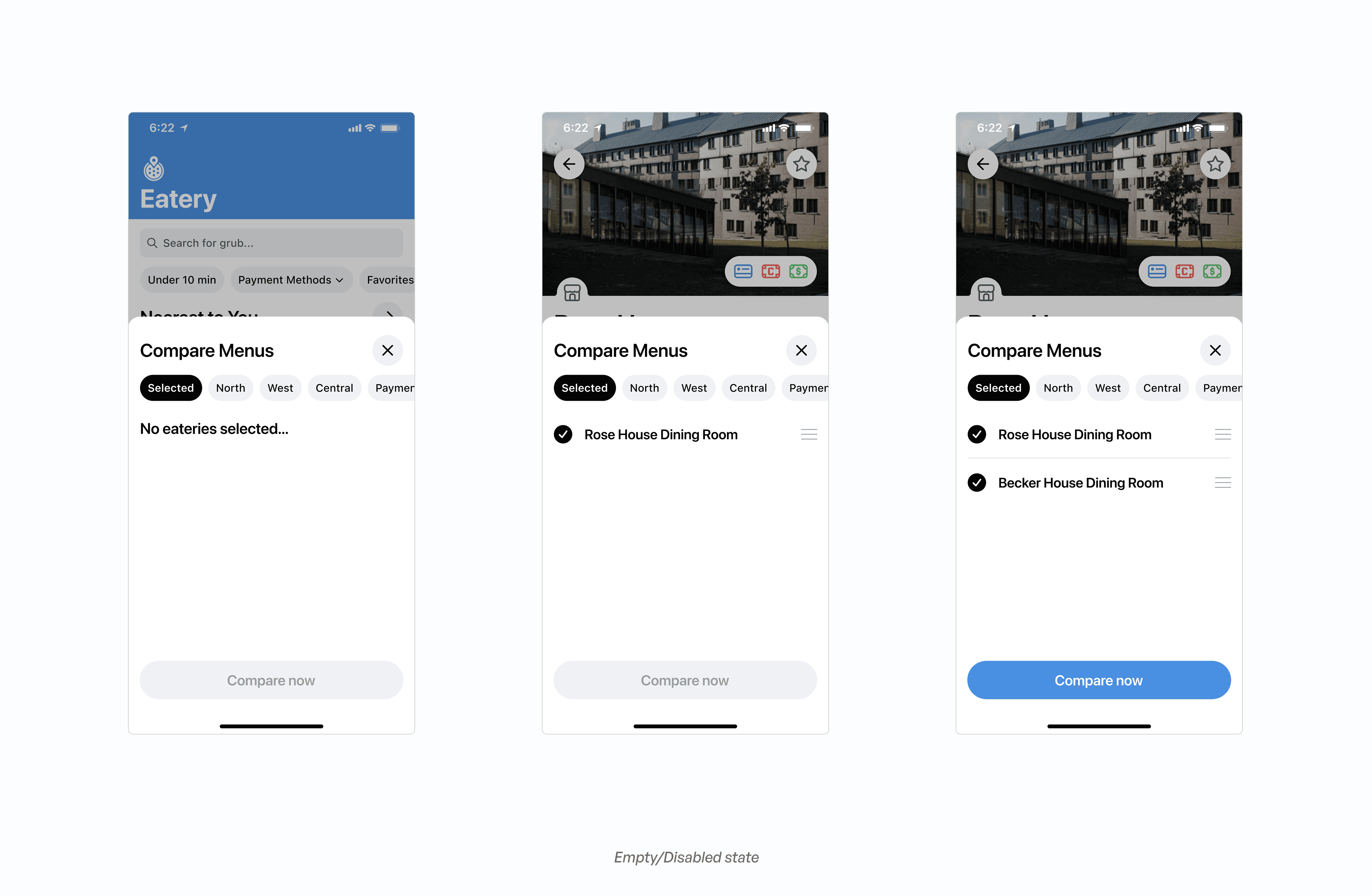
A few smaller cases needed to be addressed before the feature was usable. Users needed to be able to edit or reorder which eateries they were comparing without restarting the whole flow.
A few smaller cases needed to be addressed before the feature was usable. Users needed to be able to edit or reorder which eateries they were comparing without restarting the whole flow.

Additionally, the feature needed a clear state for when fewer than two eateries were selected, since comparison can’t occur with one.
Additionally, the feature needed a clear state for when fewer than two eateries were selected, since comparison can’t occur with one.
TESTING
Usability testing revealed two points of friction in the feature.
Usability testing revealed two points of friction in the feature.
I ran usability testing with 47 users before shipping. Overall the feature performed well, but two issues stood out. First, 9 users reported losing track of which eatery's menu they were actively viewing while swiping between tabs, since they weren't used to the dining hall name being placed at the bottom of the screen. As sessions progressed, these same users showed clear signs of adjusting to the new layout with continued use. To help reinforce that adjustment, a gray state would be added to inactive tabs, making the active tab's label stand out more clearly at a glance.
I ran usability testing with 47 users before shipping. Overall the feature performed well, but two issues stood out. First, 9 users reported losing track of which eatery's menu they were actively viewing while swiping between tabs, since they weren't used to the dining hall name being placed at the bottom of the screen. As sessions progressed, these same users showed clear signs of adjusting to the new layout with continued use. To help reinforce that adjustment, a gray state would be added to inactive tabs, making the active tab's label stand out more clearly at a glance.

Second, 6 users showed moments of hesitation during the first task, suggesting some uncertainty around what to do with the new floating button for comparing menus. To promote usage and avoid confusion, I designed a short tutorial screen to appear the first time someone encounters the update.
Second, 6 users showed moments of hesitation during the first task, suggesting some uncertainty around what to do with the new floating button for comparing menus. To promote usage and avoid confusion, I designed a short tutorial screen to appear the first time someone encounters the update.

WHAT SHIPPED?
Average time on the app dropped by roughly 9%, about 30 seconds, the month after launch.
Average time on the app dropped by roughly 9%, about 30 seconds, the month after launch.
Compare Menus shipped to iOS and Android. A month after launch, average time on the app was down by about 30 seconds against the 5:36 baseline, which was roughly a 9% drop. Although not a perfect metric, time-on-app is a proxy metric for our primary mission of helping people make quick decisions.
Compare Menus shipped to iOS and Android. A month after launch, average time on the app was down by about 30 seconds against the 5:36 baseline, which was roughly a 9% drop. Although not a perfect metric, time-on-app is a proxy metric for our primary mission of helping people make quick decisions.
WHAT I TOOK FROM IT
This was my first shipped project, and it taught me how much weight interaction carries in making something feel intuitive, more than the interface alone ever could.
This was my first shipped project, and it taught me how much weight interaction carries in making something feel intuitive, more than the interface alone ever could.
Small details, the scroll direction a button responds to, empty states, and communication design ended up mattering more than anything visible on the surface. UI alone couldn't have solved the problem; it took careful attention to interaction and the details around it to create a feature that could genuinely impact the thousands of users who rely on Eatery daily. I had a lot of fun exploring motion and interaction in this project and discovering how much it can add to an app's usability.
A big thank you to my design lead, Liam, and the rest of the Cornell AppDev team for their support and contributions to this project.
Small details, the scroll direction a button responds to, empty states, and communication design ended up mattering more than anything visible on the surface. UI alone couldn't have solved the problem; it took careful attention to interaction and the details around it to create a feature that could genuinely impact the thousands of users who rely on Eatery daily. I had a lot of fun exploring motion and interaction in this project and discovering how much it can add to an app's usability.
A big thank you to my design lead, Liam, and the rest of the Cornell AppDev team for their support and contributions to this project.
Small details, the scroll direction a button responds to, empty states, and communication design ended up mattering more than anything visible on the surface. UI alone couldn't have solved the problem; it took careful attention to interaction and the details around it to create a feature that could genuinely impact the thousands of users who rely on Eatery daily. I had a lot of fun exploring motion and interaction in this project and discovering how much it can add to an app's usability.
A big thank you to my design lead, Liam, and the rest of the Cornell AppDev team for their support and contributions to this project.

OVERVIEW
Eatery is Cornell's central dining information app, serving over 10,000 students and faculty. The mission of the app is to help its users make quick and informed dining decisions. To better support that mission, my task was to design the Compare Menus feature, an efficient way to view more than one dining hall's menu.
TEAM
Design
TIMELINE
3 months
ROLE
Product Designer
SKILLS
Interaction Design,
UX Research,
Mobile UI
OVERVIEW
Eatery is Cornell's central dining information app, serving over 10,000 students and faculty. The mission of the app is to help its users make quick and informed dining decisions. To better support that mission, my task was to design the Compare Menus feature, an efficient way to view more than one dining hall's menu.
TEAM
Design
TIMELINE
3 months
ROLE
Product Designer
SKILLS
Interaction Design,
UX Research, Mobile UI